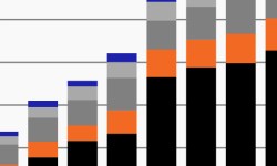
Investor demand for private assets remains robust
As investment opportunities shift, this week’s chart looks at institutions’ historical fundraising across private markets.
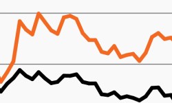
As growth turns higher, leading indicators remain flat
Markets have rallied amid better-than-expected economic data, but leading indicators show little optimism. This week’s chart looks at the growing gap.
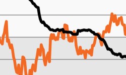
Could an investor vs. Fed divide drive volatility?
This week’s chart looks at market-based expectations for Fed rate cuts, which have increasingly run counter to policymakers’ intentions.

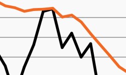
2023 has seen an extraordinarily concentrated rally
Stocks have rallied in 2023. But this week’s chart looks at the massive divide between returns on the Big 6 tech stocks and the rest of the S&P 500.
Stocks trapped in (an expensive) trading range?
Stocks have spent the last year range-bound. This week’s chart looks at the challenges they may face moving materially higher.
Family offices to increase allocation to alternatives
This week’s chart looks at institution’s growing interest in alts; they expect to grow allocations to real estate, private debt and private equity.