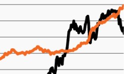
With investor sentiment stretched, time to diversify?
This week’s chart looks at the spread between bullish and bearish investors, which has widened significantly in the past several months.
A compelling growth opportunity in private equity secondaries?
This week’s chart looks at private equity secondaries’ outperformance versus the broader PE market, focusing on what has driven the outperformance.
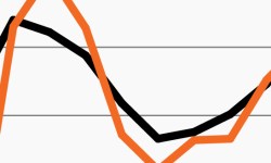
Private and public company earnings taking divergent paths
This week’s chart looks at a shifting opportunity set as the private middle market shines while small cap company earnings remain challenged.

Family offices plan material increase to private markets
This week’s chart looks at family office CIOs’ plans to increase allocation to alts in 2024, specifically private credit and private equity.

The clear opportunity in a healthy middle market
Despite allocation challenges, revenue growth in the U.S. middle market remains healthier than ever as this week’s chart highlights.
As yields decline, so does cash’s appeal
Money market assets keep growing despite yields declining. This week’s chart looks at the diverging trends as cash may be losing its luster.